40% Upside And 12% Dividend Yield

Swap shares and save over $2? That’s a great idea. I’d be happy with $1 if I can collect it a few thousand times.
Arseniy45/iStock via Getty Images
Get ready for charts, images, and tables because they are better than words. The ratings and outlooks we highlight here come after Scott Kennedy’s weekly updates in the REIT Forum. Your continued feedback is greatly appreciated, so please leave a comment with suggestions.
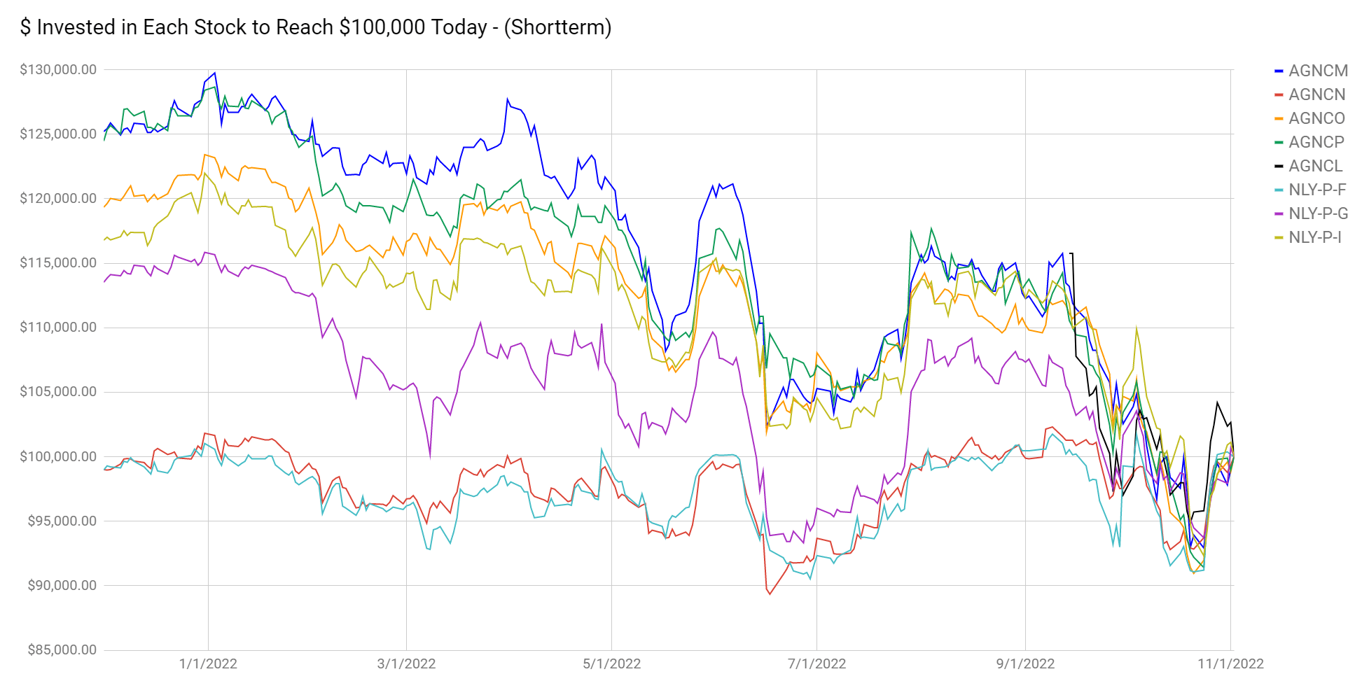
We’re starting with a brief note on preferred shares. The gap in valuation between the cheapest and most expensive preferred shares for AGNC Investment Corp. (AGNC) and Annaly Capital Management, Inc. (NLY) remains in place. See the chart below for the amount invested on any day (with dividends reinvested) to reach $100k today:
The REIT Forum
We use this chart because it lets us focus on how we reached the current valuation, rather than focusing on the price change from one arbitrary date in the past.
The difference in performance is absurd. Investors in AGNCM and NLY-I are roughly even year-to-date (including dividends). Maybe down as much as 2%. That’s amazing given the 20% drop on other shares. How much would you pay to have shares float two years earlier? 20%? That would be a really dumb idea. Who pays 20% so they can get two years of collecting about 11% rather than collecting about 8.3%? Is an extra 3% or so for two years’ worth 20%? No, because math still works. Paying 20% to get back somewhere around 6% is just an awful idea.
Paying more today than can hope to get back in the future is not investing. That’s literally the opposite of investing. Terrible. I’ve got over this extensively in prior articles. Will the market fail even harder? Maybe. As it stands, the long-term math is definitive. Eventually, we all know AGNCN and NLY-F will deliver weaker returns than the other preferred shares in the chart. Well, those of us who can do math know it. Regardless, this market failure has been going on for months and continued to get even worse.
On one share this isn’t material, but for investors swapping a few thousand shares, it’s an outstanding return.
For the investor who wants this spelled out, it goes like this:
Sell AGNCN at $23.89. Buy AGNCO at $19.68. Collect the difference of $4.21. Lose out on the difference in dividends over the next two years. That difference will most likely be around $1.60. Maybe as much as $2.00 if Jerome Powell goes nuts in his attack on the economy. If you miss out on $1.60 to $2.00 over two years but you saved $4.21, was that a good deal or a bad deal?
Obviously, it was good.
As a bonus, you could even collect some interest on all that cash you saved upfront. Is this math hard? It seems to be for some people. Seriously, check out the comments for someone arguing that paying $4.21 for $1.60 to $2.00 is a good deal because they see “income” as valuable and cash in their pocket as trash.
Interest Rates
How do you like the recent action?
MBSLive
Chairman Powell continued his push to reduce inflation, rather than permitting the market to solve it. We believe the free market is capable of solving supply chain problems, given a little time, and expect the current sequence of rate hikes to create Powell’s Recession. Raising interest rates are severely slowing the economy. It may reduce the rate of inflation slightly, but less output means our country will have a smaller pie to split.
Quick question: What’s the real measure of economic success for a nation?
It’s the volume of goods and services the nation can produce. It’s that simple. The recession reduces supply significantly.
Supply and Prices
Remember how everyone likes to complain about the “lack of affordable housing?”
I hate that line. Most people who complain about the lack of affordable housing still favor massive restrictions on the production of housing. You can’t reasonably complain about the price of something being too high while supporting efforts to prevent production. When production is prohibited or requires massive hurdles, it reduces supply.
If only we had a good example. Well, what happened after prohibition?
“The price of alcohol roughly tripled or quadrupled after the 18th Amendment took effect.”
Despite efforts to reduce the construction of housing (especially apartments), we still saw apartment starts rocketing higher in early 2021 and maxing out around early 2022. Why? Because rents were high and mortgage rates were low. That made building apartments so attractive it was worth developers putting in the cash to overcome obstacles to construction. Then mortgage rates (including commercial mortgages) went through the roof and plans for new apartment construction were dramatically reduced:
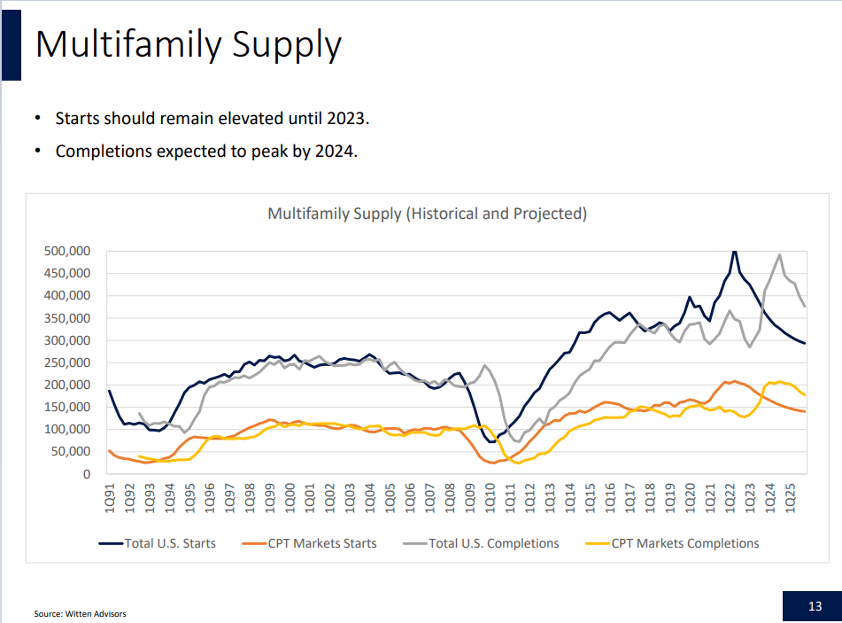
CPT, Witten Advisors
Thanks to higher interest rates weakening the economy and making financing more expensive, forecasts are calling for multi-family starts to fall by more than 200,000 units.
What’s the single biggest headwind to raising rents? New supply. It came up regularly on the earnings call. It always has.
So, what happens when we reduce the construction of supply? Higher rental rates. Think renters are going to move out and buy a house while paying 7% for a mortgage? Good luck with that. If they couldn’t afford it at 3%, they sure can’t afford it at 7%.
That’s your recession in a nutshell.
Rates increased dramatically. Plans for new supply have been severely reduced. As projects are canceled or delayed (causing others to be delayed as well), job growth is reduced. Fewer jobs lead to workers with worse prospects and lower wage growth. Some people consider this a victory, but this is still a scenario with less supply.
Many Americans have been told that this is a price worth paying. It’s not. It’s a negative sum game.
A great answer would’ve been a sharp decrease in annual deficits. That still probably would have created a recession, but it would’ve done so without adding to the debt. The current environment is higher interest rates (to cool the economy) combined with massive deficits (to heat the economy). See the problem? Obviously, Chairman Powell does not decide on annual deficits. However, his position simply didn’t have the right tool for the job.
I wouldn’t advocate giving those tools to any Chairman of the Federal Reserve. Yet, we should remain aware of the limitations.
How About a Bullish Pick?
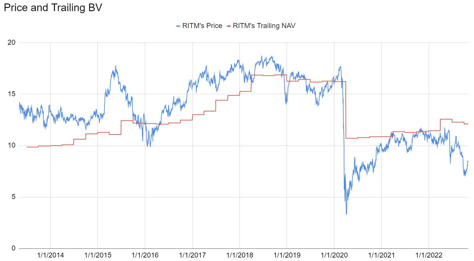
You already know we like the AGNC and NLY preferred shares (but AGNCN and NLY-F dramatically less than the others). How about a common share? Rithm Capital Corp. (RITM), the company with a terrible name, provided a great earnings release. RITM’s current BV is in the $12.00 to $13.00 range. Using one recent estimate for $12.50, RITM at $8.40 trades at about 67% of book value. That gives them a substantial amount of room to rally higher.
While RITM’s price has suffered, they’ve done quite well against rising interest rates. Their huge portfolio of MSRs (mortgage-servicing rights) was a huge advantage. As the prepayment speed slowed, the valuation on the MSRs increased. MSRs give the company the right to service a mortgage. They generate income from their portion of each payment that flows through their department. The prepayment rate continued to fall. Management predicts it dropping down even further, to around 4% to 6%. That means the MSR lasts materially longer, which means larger total cash flows. However, the increase in value can be limited by higher interest rates leading to higher discount rates.
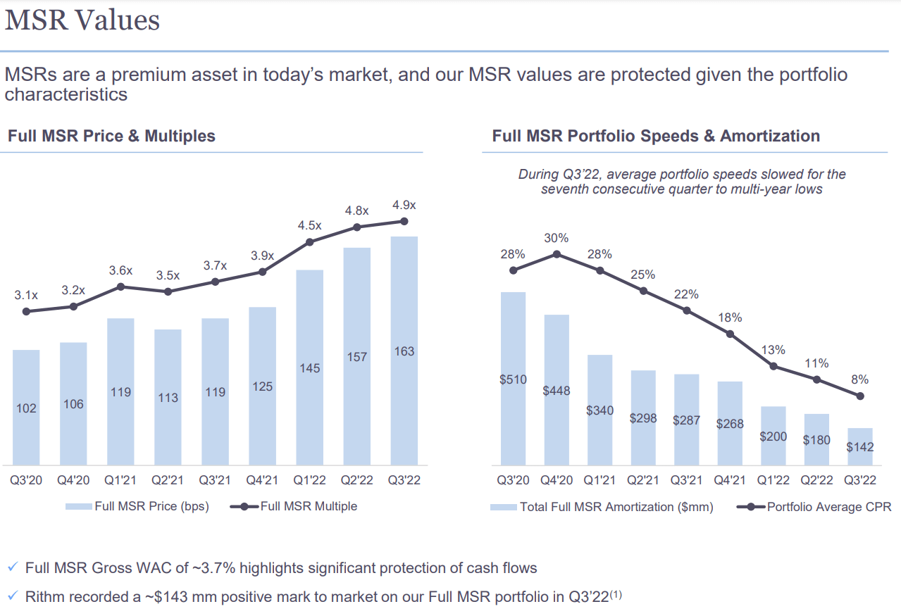
RITM Q3 2022 Investor Presentation
Adjusted for dividends, RITM is down about 14.7% year-to-date. Excluding dividends, RITM is down about 21.6% year-to-date. So how does RITM look?
At the start of the year, book value was $11.44 per share.
At the end of Q3 2022, book value was $12.10 per share.
That’s a gain $.66 per share. RITM did that while internalizing management at a cost of $.70 per share. The cost was entirely expensed already. It was a one-time cost, and it was promptly removed from book value per share. Despite that hit, book value per share still increased by $.66. Remember that RITM also paid out $.75 in dividends this year. So, we’ve seen through different areas worth about $.70 each on average. That was $.75 of dividends, $.70 in costs to reduce recurring expenses, and $.66 for the gain in book value. All combined, that would be $2.11 through the first three quarters on a starting BV of $11.44. That’s a really good start to the year, yet the fact remains that the share price is down materially.
Shares began the year at $10.71. Despite book value per share growing, share prices fell from $10.71 to $8.40.
That’s simply a much better deal for investors.
As it stands RITM offers investors about a 12% dividend yield from the $1.00 per share in dividends. Earnings available for distribution came in at $.32 for Q3 2022 and $.31 for Q2 2022. For mortgage REITs, that’s a respectable coverage.
Note: To get a full 12% yield, investors would need a price of $8.33. That’s only $.07 from today’s closing price of $8.40. That’s close enough to accept a rounding error with today’s yield at 11.9%.
For subscribers of The REIT Forum, Scott will have a much more comprehensive review of RITM’s Q3 2022 results coming out soon.
Could RITM actually trade near book value again? Well, they’ve been one of the few mortgage REITs that frequently achieved a premium to book value per share in the past:
The REIT Forum
On average, RITM actually traded at a premium to book value over that period. Is it unreasonable to think RITM might trade around 94% to 95% of book value in the future? It doesn’t seem unreasonable to me. If that happens, it will represent 40% upside from the current price. If shares rallied up to 100% of our recent estimated book value, it would be about 49% upside. Not bad for a stock with a dividend yield of nearly 12%.
RITM is one of our larger positions. We also have a material position in RITM-D, which is one of the preferred shares. I think RITM-B, RITM-C, and RITM-D are great ideas here also.
Outlooks
Bullish on RITM and several preferred shares: AGNCM, AGNCO, AGNCP, AGNCL, NLY-G, NLY-I, RITM-B, RITM-C, and RITM-D.
Stock Table
We will close out the rest of the article with the tables and charts we provide for readers to help them track the sector for both common shares and preferred shares.
We’re including a quick table for the common shares that will be shown in our tables:
Let the images begin!
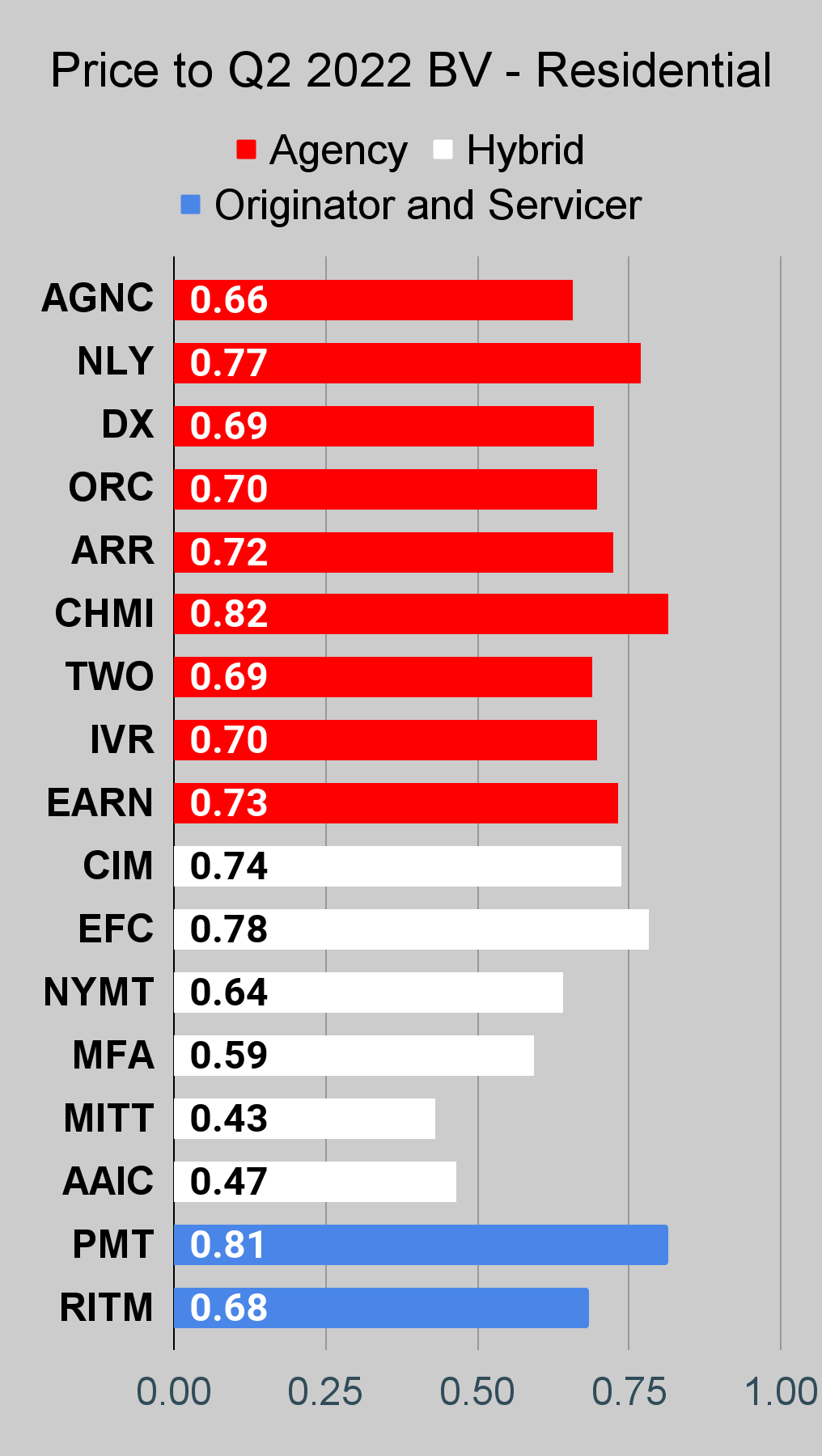
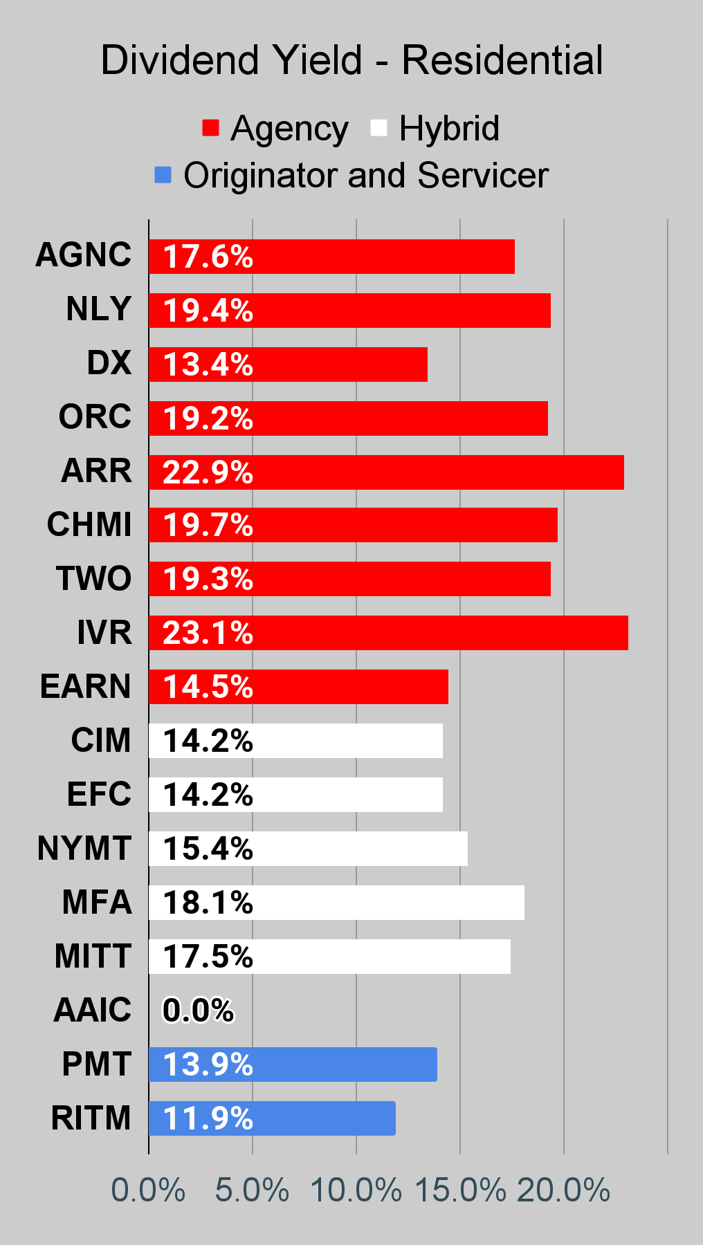
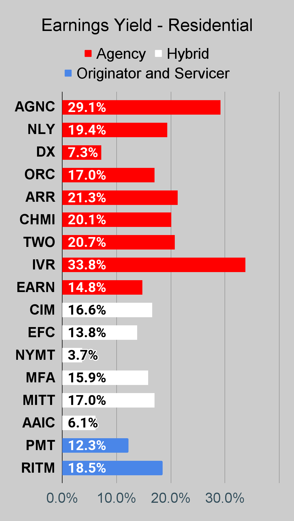
Residential Mortgage REIT Charts
Note: The chart for our public articles uses the book value per share from the latest earnings release. Current estimated book value per share is used in reaching our targets and trading decisions. It is available in our service, but those estimates are not included in the charts below. PMT and NYMT are not showing an earnings yield metric as neither REIT provides a quarterly “Core EPS” metric.
 The REIT Forum |
 The REIT Forum |
 The REIT Forum |
Commercial Mortgage REIT Charts
 The REIT Forum |
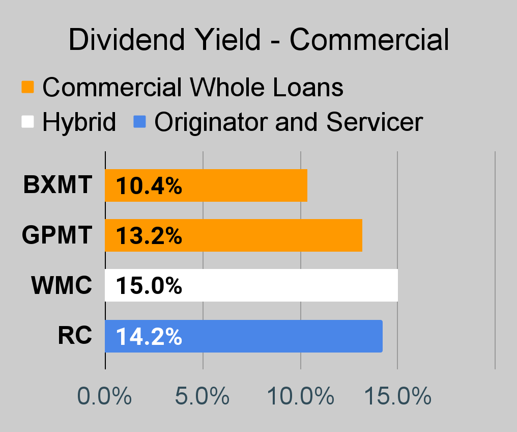 The REIT Forum |
 The REIT Forum |
BDC Charts
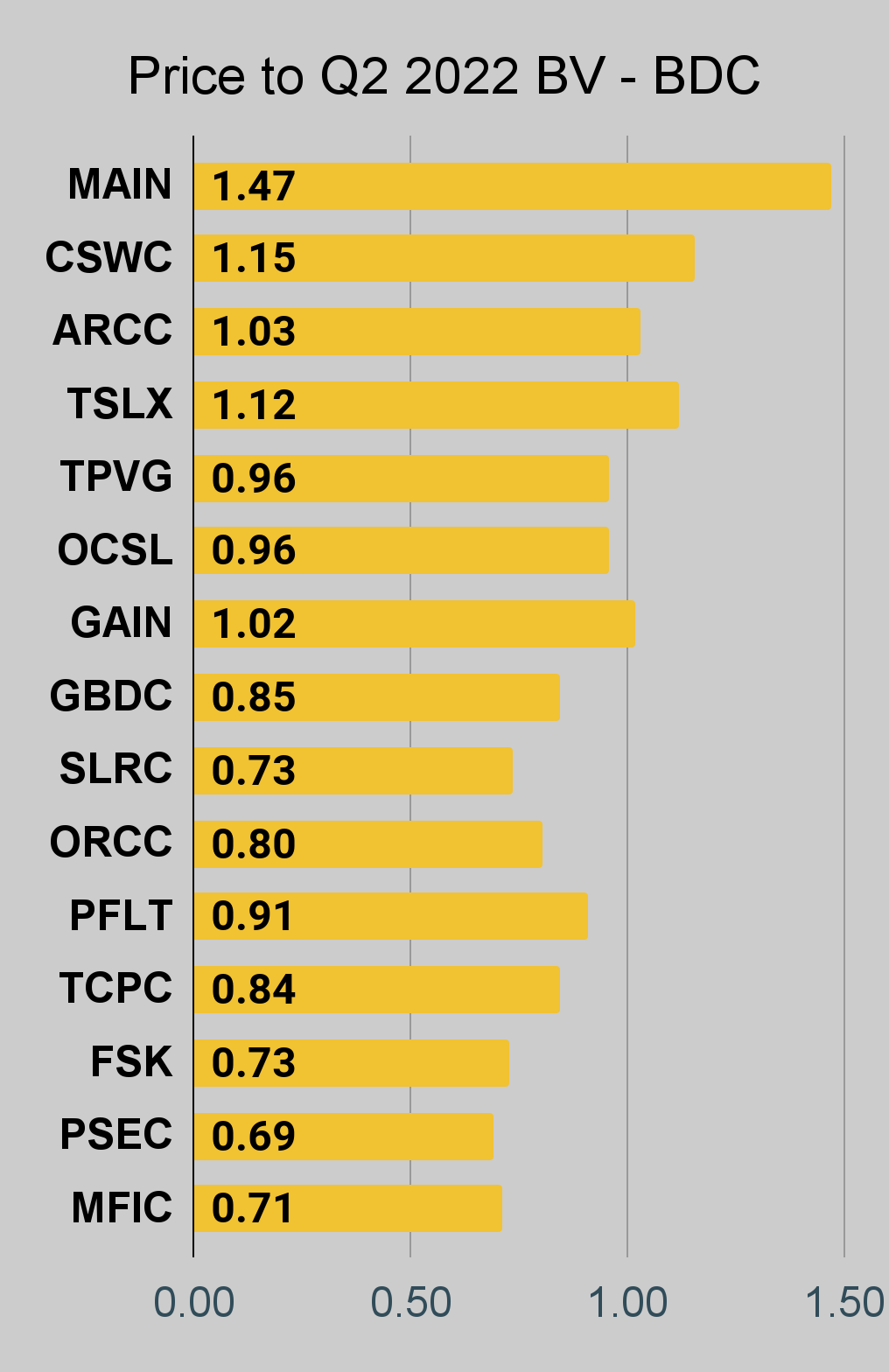 The REIT Forum |
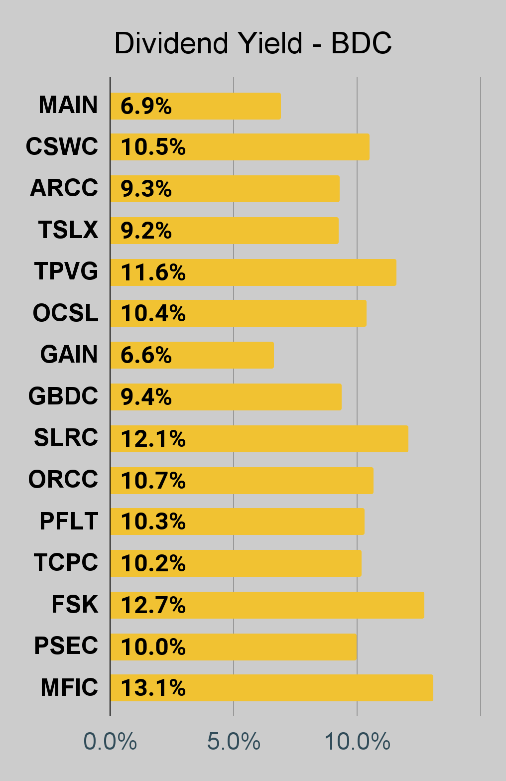 The REIT Forum |
 The REIT Forum |
Preferred Share Charts
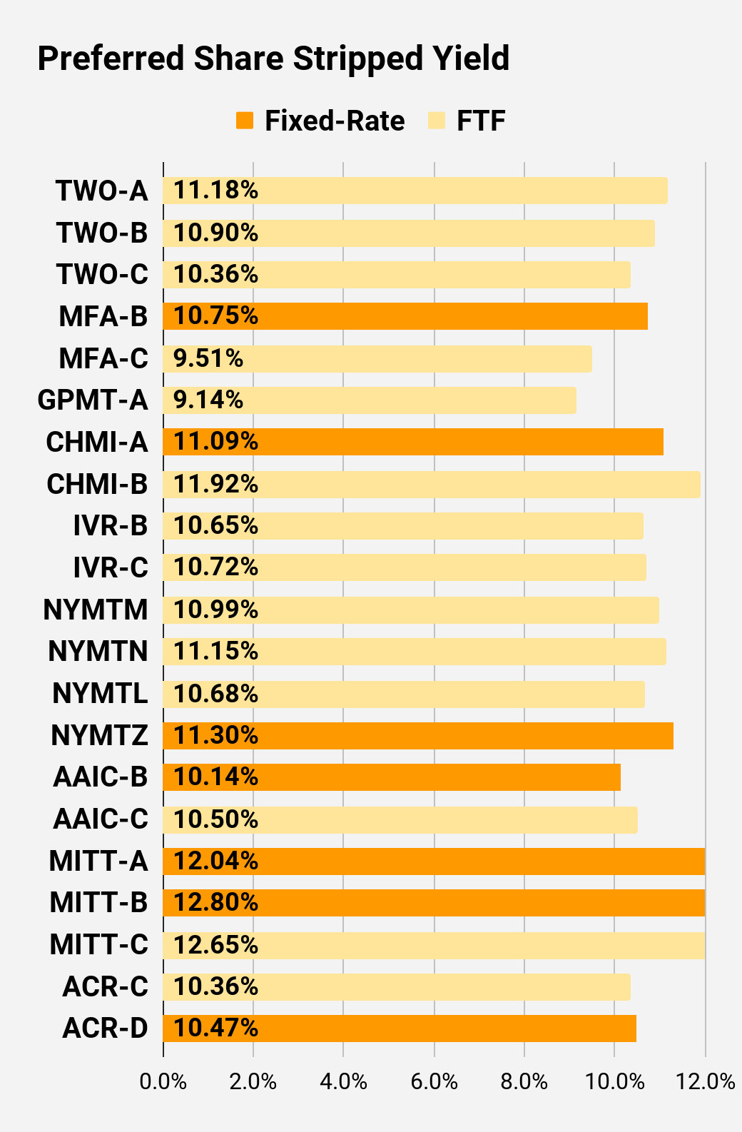
I changed the coloring a bit. We needed to adjust to include that the first fixed-to-floating shares have transitioned over to floating rates. When a share is already floating, the stripped yield may be different than the “Floating Yield on Price” due to changes in interest rates. For instance, NLY-F already has a floating rate. However, the rate is only reset once per three months. The stripped yield is calculated using the upcoming projected dividend payment and the “Floating Yield on Price” is based on where the dividend would be if the rate reset today. In my opinion, for these shares the “Floating Yield on Price” is clearly the more important metric.
 The REIT Forum |
 The REIT Forum |
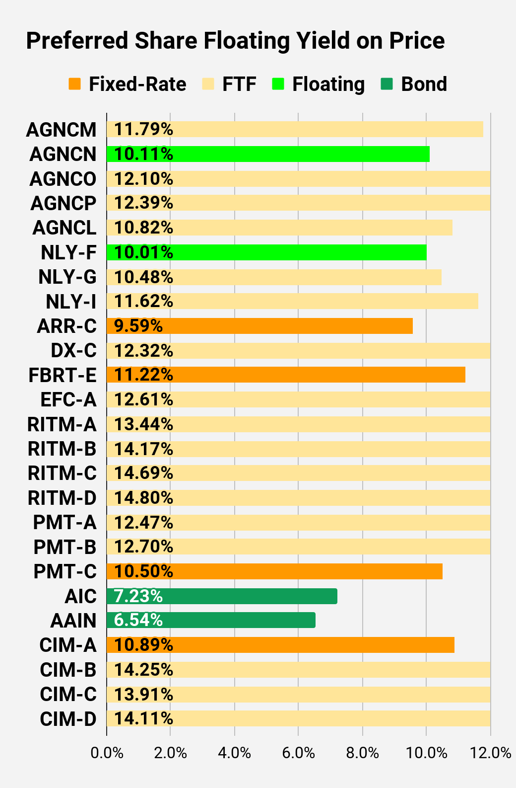 The REIT Forum |
 The REIT Forum |
 The REIT Forum |
 The REIT Forum |
Preferred Share Data
Beyond the charts, we’re also providing our readers with access to several other metrics for the preferred shares.
After testing out a series on preferred shares, we decided to try merging it into the series on common shares. After all, we’re still talking about positions in mortgage REITs. We don’t have any desire to cover preferred shares without cumulative dividends, so any preferred shares you see in our column will have cumulative dividends. You can verify that by using Quantum Online. We’ve included the links in the table below.
To better organize the table, we needed to abbreviate column names as follows:
- Price = Recent Share Price – Shown in Charts
- BoF = Bond or FTF (Fixed-to-Floating)
- S-Yield = Stripped Yield – Shown in Charts
- Coupon = Initial Fixed-Rate Coupon
- FYoP = Floating Yield on Price – Shown in Charts
- NCD = Next Call Date (the soonest shares could be called)
- Note: For all FTF issues, the floating rate would start on NCD.
- WCC = Worst Cash to Call (lowest net cash return possible from a call)
- QO Link = Link to Quantum Online Page
Second Batch:
Strategy
Our goal is to maximize total returns. We achieve those most effectively by including “trading” strategies. We regularly trade positions in the mortgage REIT common shares and BDCs because:
- Prices are inefficient.
- Long term, share prices generally revolve around book value.
- Short term, price-to-book ratios can deviate materially.
- Book value isn’t the only step in analysis, but it’s the cornerstone.
We also allocate to preferred shares and equity REITs. We encourage buy-and-hold investors to consider using more preferred shares and equity REITs.
Performance
We compare our performance against four ETFs that investors might use for exposure to our sectors:

The REIT Forum
The four ETFs we use for comparison are:
|
Ticker |
Exposure |
|
One of the largest mortgage REIT ETFs |
|
|
One of the largest preferred share ETFs |
|
|
Largest equity REIT ETF |
|
|
The high-yield equity REIT ETF. Yes, it has been dreadful. |
When investors think it isn’t possible to earn solid returns in preferred shares or mortgage REITs, we politely disagree. The sector has plenty of opportunities, but investors still need to be wary of the risks. We can’t simply reach for yield and hope for the best. When it comes to common shares, we need to be even more vigilant to protect our principal by regularly watching prices and updating estimates for book value and price targets.
Ratings:
Bullish on RITM and several preferred shares: AGNCM, AGNCO, AGNCP, AGNCL, NLY-G, NLY-I, RITM-B, RITM-C, and RITM-D.