Developing Android apps in Ukraine in 2022
Material You and Android 12L and 13’s big-screen focused changes are all the rage right now, but so far, we have mostly looked at it from a consumer perspective. We covered how Google apps are switching to new interfaces, which third-party apps follow suit, and how well the theme is implemented across the board. But how do these changes affect developers, and does Google even give them the right tools to bring their projects up to snuff?
Up-and-coming Ukrainian indie app developer Pavlo Rekun sat down with Android Police to talk about updating his apps with Material You and tablet-focused optimizations, as well as the situation in his country and how it affects not only his work and life.
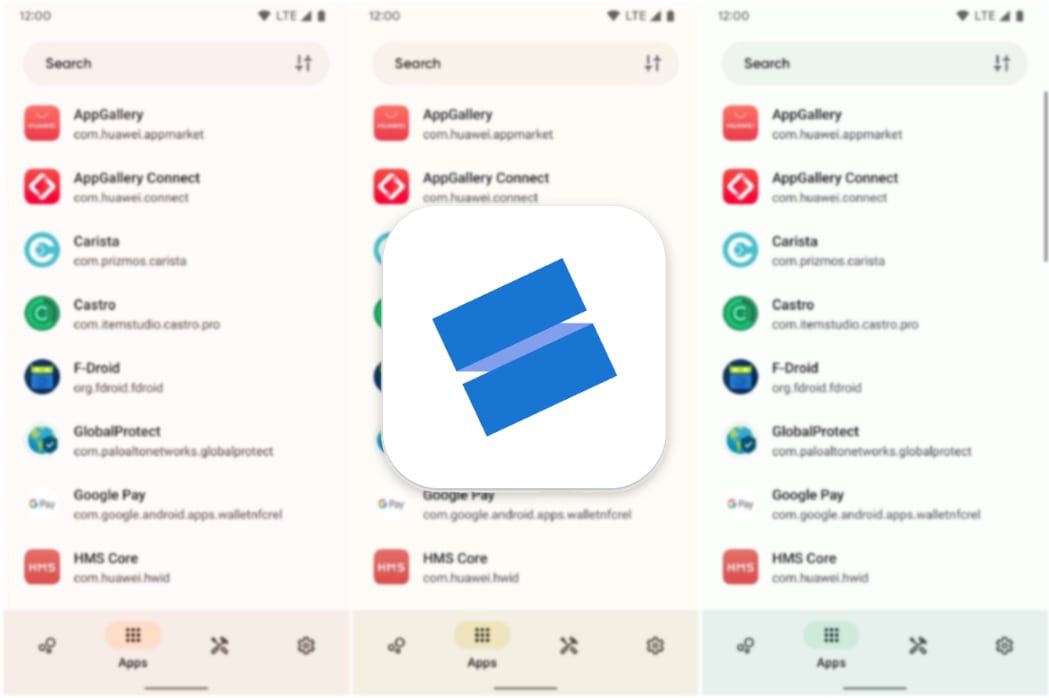
Pavlo’s flagship app Skit showing off its Material You theme
Pavlo Rekun has been an indie developer since 2015 and focuses on, as he says, “really useful ad-free and scum-free apps” for Android. He recently updated his app manager Skit to version 3.0 in the midst of the Russian attack, complete with Material You elements and tablet-focused optimizations. Now, he has the rest of his lineup left in the pipeline, consisting of subscriptions manager Tilla, system info app Castro, and EXIF editor Graphie.
Note: The interview has been lightly edited for clarity.
Android Police: We usually cover Material You from a consumer-perspective, focusing on how it changes the look and feel of apps for phone users. But for you as an Android developer, what was or is the biggest challenge with Material You?
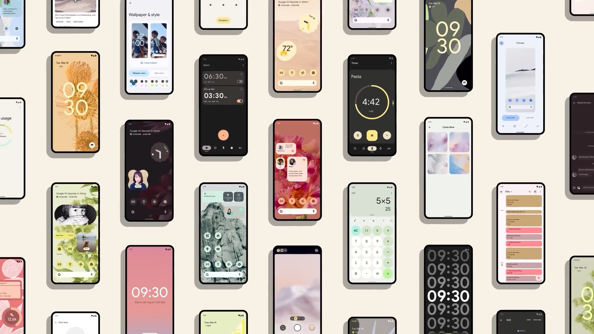
Pavlo Rekun: Well, the biggest challenge with Material You for me—and I guess for many other developers (looking at the list of open issues on the GitHub Material Components repository)—is the way how Google “announces” things and how it implements them. Let’s say, Material You was announced a year ago, but Material Components (the development kit which holds all UI components for Material 2 and now for Material You) were released only half a year ago, allowing indie devs to start adapting UI.
This is the main problem — many UI components are being shown in and used by Google apps, but those components are coming into the development kit with some big delay, which means some developers have to just wait (like I did it), or start creating their own components based on guidelines.
Source: Pavlo Rekun
The other problem here, that currently, Google is trying to promote Jetpack Compose (a new framework for building adaptive UI) and most new UI components come to it at first, and only after a few months they become available for generic XML interface builders. At least there are not so many differences as there were when updating original Material to Material 2, just some theme and components updates, and the base interface is ready.
Since all tools are ready to use now, I will work on adapting my other apps Castro, Graphie, and Tilla with Material You later this year, too.
So Google is basically showing off what it envisions without actually providing the tools quickly enough.
Yeah, tools are coming with much delay, so I guess it was the main problem for them, all of the Google apps already got their UI to revamp, but third-party apps are just starting to adopt Material You, but I guess the process will go faster now when most of the tools are ready now (only sliders and bottom navigation bar are still missing).
As someone who doesn’t develop apps, what’s the issue with Jetpack Compose?
It is a beautiful tool and I don’t see any problems with it as a development kit, but the main issue is that Google puts its focus on it, leaving generic tools (XML) behind. This means new development tools come first to Jetpack Compose, and only with some delay to the older framework. So if you are already using Jetpack Compose, everything is cool for you, but if you haven’t adapted it yet, then you may face some problems with new tools coming later.
That makes sense. Probably a lot of bigger studios are slow at transitioning, so we might just have to wait quite a while for design updates from big apps. To get back to Material You, though, do you think the new design language is a good idea at all from a UX and interface design perspective?
Well, I couldn’t say I am a big fan of the current Material You implementation, since the spectrum of colors that are extracted from the wallpapers is limited to 10 colors or so — something which is much improved in Android 13 already. But I guess it is just not enough to become a “personal” design framework, because now all of the apps look very similar, colors are the same, and components are the same.
That is actually why I have created a set of hand-crafted themes in the new Skit update, to allow users to set the color of the UI without tying it to Dynamic Colors or the default app’s theme. The main idea for this feature is directed at people on older Android versions, though, to mock Dynamic Colors for older devices.
I could bet that in the next releases, Google will add some ways to change the shapes of components, and maybe make specific changes for specific groups of apps. As for the UX, I don’t see any big changes coming from Material 2, maybe components just became bigger.
Could you imagine how Material You will evolve over the next few years? You already mentioned Android 13, but would you like to elaborate on these specific changes for groups of apps you mentioned?
I meant that currently changes to Dynamic Colors are applied to all the apps, but I would like to see some kind of feature allowing the user to specify a set of apps, “tools” for example, and set design settings for each group. Also, something except colors, shapes, elevations, fonts, more control over that would be good too. Making it more personal is a good idea, as for me, this will help avoid the current situation when all apps (which support Material You) look just the same.
One more question on that whole UI front, though it’s a bit further out from the core of this Material You topic. You added support for edge-to-edge navigation in Skit, as per the release notes. I’ve always wondered if it’s difficult to do this for developers? A lot of apps seem to refuse to add support for this, including many Google apps.
Well, it was enabled in previous updates of the Skit, but in the 3.0 update, I have expanded and improved its support for all screens. Speaking of difficulty, there are some libraries that are coming from AndroidX that help you measure system bar paddings (navigation and status bars) and apply them to your layout. However, you still have to do it manually for all screens. Maybe that is the reason why other developers are not hurrying to implement it.
Oh, that sounds tedious. It looks like Apple’s approach worked better there — I think most if not all apps on iOS support Apple’s version of transparent navigation bars.
Apple is restricting more features and also, there is much less fragmentation on its platform. You just have to check and test apps on about 10 devices, not taking iPads into account, whereas in the Android world, you have to support thousands of devices, and everything has different punch-hole screens, notches, screen sizes, and so on.
Also, Apple decided to do it from its side, while Google asked developers to adapt their apps on their own.
Let’s move on to the other big new thing for Google: big-screen optimizations for tablets and foldables. I understand that you only recently implemented bigger changes to Skit for big screen devices. Any reason why now? I’m hinting at Android 12L here, of course.
Sure, I have to say that Android 12L is a cool update for tablet users, but there are again changes that Google made for apps without updating related resources for a long time. The framework of that update is meant to automatically optimize navigation in older apps. But if your app is already using a single-activity structure (one screen with replaceable contents), then you just have to make sure that the UI and UX are adapted to big screens. So again, if you are using the latest tools and architecture, then Android 12L won’t help you too much. There are many changes to the UI of the system, to work better on tablets and better support foldables, but I don’t have any experience in supporting that yet.
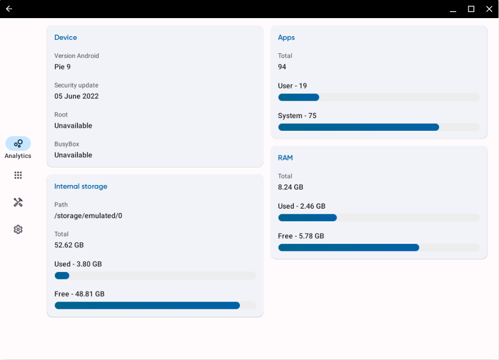

So, in Skit 3.0 I just wanted to make sure that the UI is suitable for tablet screens, which is why I am using a side navigation bar for now and a grid to display more items on a bigger screen. I also wanted to make sure that the app works well on Chrome OS devices. So yeah, most of the screens now show content in better views for tablets (grid instead of lists, extended floating buttons instead of small ones, etc.).
Yep, it definitely looks great on my Chromebook. I was also curious, how do you feel about Google’s push to optimize apps for tablets and big screens again?
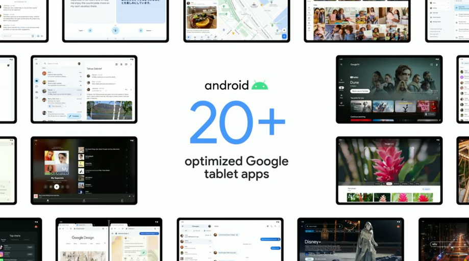
Yeah, over the last year, I’ve seen that Google is trying to push Android everywhere again: Wear OS and Pixel Watch, Android 12L and 13, and Pixel Tablet. I guess Apple’s experience with iPads is not leaving Google alone in that. But again, as it was with the release of the tablet-exclusive Android 3.0, it will depend on app developers. If they optimize their apps for tablets, it might work, but developers will look at hardware sales and users’ wishes. Currently, I don’t think it is worth spending your free time on optimizing for big screens, but this will change in the future as Jetpack Compose comes to more developers (it is basically easier to support multiple screen sizes using it) and if Google is willing to highlight apps optimized for big screens.
Source: Google
Another big point why iPads are selling so well is that there are many professional apps on them, like LumaFusion, Photoshop, and Pixelmator, and so many people I know use iPads as their work station. But right now, there are no such apps for Android that could help users move from PC to high-quality Android tablets. There are just no professional apps for it. There are good starts here, though — LumaFusion is porting its app for Samsung tablets. I guess if more apps and high-quality hardware will come, the Android tablet world will live again. I am especially going to support tablets in my apps and watch how they will work.
Let’s just hope that Google can get everyone on board this time around and that the momentum will keep going, with your commitment and that of others. Foldables might even play a big part in that. Do you think that those will once be the standard form factor for phones?
Well, I am not a big fan of them, I just don’t understand why I should buy them. Like, in Ukraine, there are some post-USSR businessmen that always got to have the most expensive phone. It started with Vertu in the 00s, then it was some freaky golden iPhones, and now many of them are moving to the Galaxy Fold (I guess it is not named Z anymore?). That displays my feelings for the form factor for now – just an expensive toy. But I would like to see some kind of base phone that can roll out to a small tablet screen. I guess OPPO showed some prototype with a rolling display foldable, that was cool, I would only like it to be thinner.
Do you have anything else to share regarding your own apps?
I have started creating this big update to Skit after the war started, gathered all feedback from Google Play and my development email, and implemented the most requested features for it, so try and let me know anywhere where you can find me. To celebrate this release, other apps — Castro Premium, Tilla Premium, and Graphie — received a 50% discount in Google Play so check them out, too. Speaking of them, I am already planning the next update for Tilla and Graphie, so stay tuned.
Speaking of the war, I know it’s a super difficult topic. If you want to, you can make a statement on the situation in the Ukraine and how it’s like working in these conditions. It seems like people internationally are starting to forget or get used to the situation, which is quite scary.
Yeah, people start to get annoyed with the war in my country, but the reality is that it is not going to end anytime soon and the civilized world should stand as one against the occupant and aggressor. From my side, I am doing everything I can, starting from donations to the army, medical workers, and everyone who needs help, staying in Ukraine, supporting the economy of my country, and helping my country and army with my professional skills.
I had to leave for a few months with my wife’s parents, because staying in the smaller city countryside was safer than staying in my home city due to air alerts and bombings (which were rare enough, due to the location of my city). But that doesn’t hold me back from creating new stuff for you guys. So I would like to thank everyone who supported me, including my wife Tanya, parents, and friends, and everyone who asked me how I am doing right now, which is extremely valuable right now.
Also, I would like to ask people to check out the United24 program, created by our president Volodymyr Zelenskyy, to gather donations for the Ukrainian people and army.


