XLF Is OK, But JPMorgan Chase Is Far Better (NYSE:JPM)
JoeDunckley
Thesis
As detailed in our earlier article,
We use a top-down investment approach. We use a market dashboard to take a 30,000 feet view first. We then decide where to look further – which sector, growth stocks, value stocks, bonds, or precious metals, et al.
With this approach, the thesis of this article is twofold: the financial sector is the 3rd most attractive market sector now, and JPMorgan Chase (NYSE:JPM) is even more attractive among the financial stocks. More specifically,
- The financial sector, represented by the Financial Select Sector SPDR Fund (NYSEARCA:XLF), is currently the 3rd most attractively valued market sector based on our sector dashboard (and you are welcome to download it here). Its dividend yield is above the top quartile (23% percentile inferred from its dividend yield score of 0.77) in a decade. And its yield spread relative to the risk-free rates is also ranked top 3 among all the sectors as you can see. The other sectors that feature higher dividend yield and yield spread Z-scores are small caps and energy.
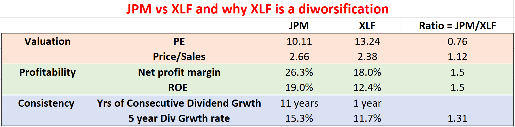
- Against this backdrop, the second chart shows that JPM is even more attractive than the financial sector on average. JPM provides superior profitability (by more than 50% as measured by ROE), better growth (more than 31% as measured by dividends raises in the past 5 years), and also better consistency and lower volatility as to be elaborated on later. Do not be alarmed by JPM’s slightly higher price-to-sales ratio (2.66 vs 2.38). JPM’s net profit margin is so much higher that its price-to-sales ratio is actually lower once the margin is adjusted for. Yet, JPM is for sale at about a 24% discount relative to XLF in terms of PE multiples.
- Especially when we use dividends as an approximation for owners’ earning yield, JPM is currently yielding 3.5%, about 1.44% above XLF’s 2.06% yield. Such a spread is near the thickest level over the past decade, signaling an attractive entry opportunity for JPM.
Note that we’ve used a similar approach in an earlier article comparing T. Rowe Price (TROW) Vs. XLF. The main differences in this article are also twofold. First, when that article was published back in April 2022, the financial sector was not as attractive as it is now relative to other sectors. Second, JPM and TROW are also different. Both JPM and TROW under difference prices levels and business outlook in April. And JPM’s business model as an integrated bank is different from TROW as an Asset Management firm.
Also note that all data are either from Yahoo Finance or Seeking Alpha after the market close price on July 8. Given the large volatilities these days, these numbers might have changed when you read this article.
We then will elaborate on the above points immediately below.
Source: author Source: author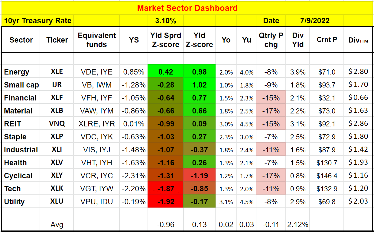
XLF and JPM – basic information
XLF is a popular financial sector fund that needs little introduction. As of this writing, it holds a total of 70 in the financial sector as you can see from the following chart. JPM is the second-largest holding, representing more than 9.5% of the total assets.
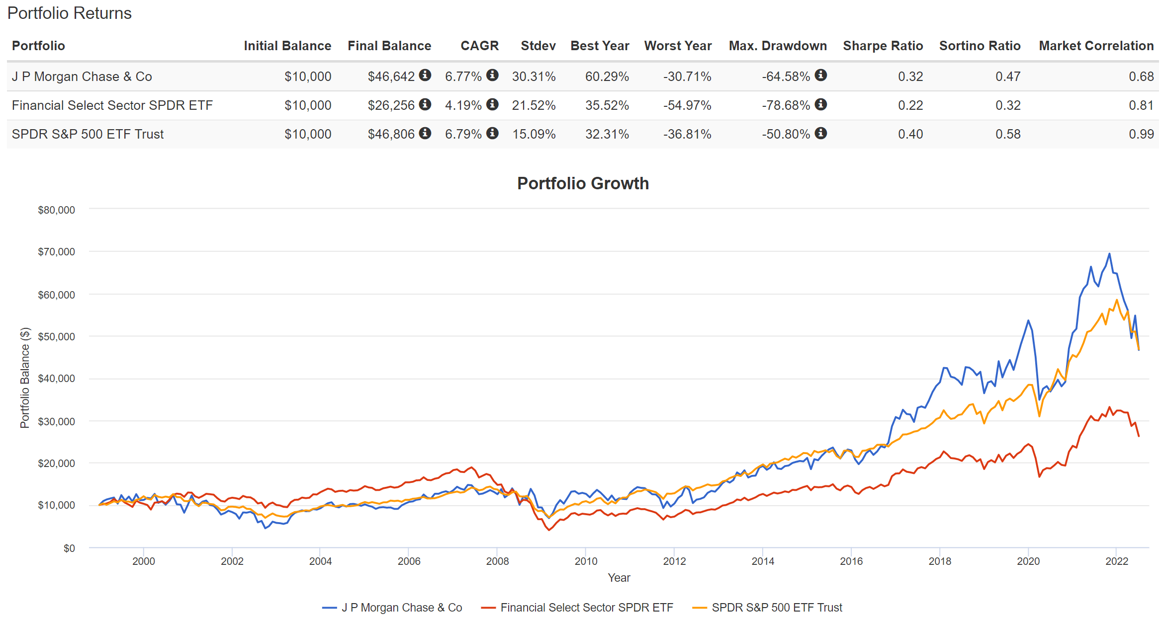
Given JPM’s large allocation in the fund, it comes as no surprise that the price actions of the fund and the stock are closely correlated as you can see from the second chart below. Although JPM has delivered far superior performance over XLF. Since the fund’s inception in 2000, XLF has delivered an annual return of 4.2% CAGR, while JPM delivered more than 6.7%. Such a performance, when accumulated over the year, has led to a large difference in total return. And as you can also see JPM has either tracked or outperformed the overall market most of the time. But XLF has been consistently lagging the overall market after the financial crisis.
A closer look also reveals that JPM actually suffered lower price volatility in terms of worst year performance and maximum drawdowns. XLF has suffered the worst year performance of almost 55% and a nerve-wracking maximum drawdown of 78% (which will take a 350% rally to break even). In contrast, JPM’s worst year performance and maximum drawdowns had “only” been about 30% and 65% (which still requires a 185% rally to break even).
To me, this is a sign of JPM’s strength (or XLF diworsification nature). The addition of a bunch of extra stocks in XLF actually increases risks at the worst times, when you need safety the most.
Seeking Alpha Source: www.portfoliovisualizer.com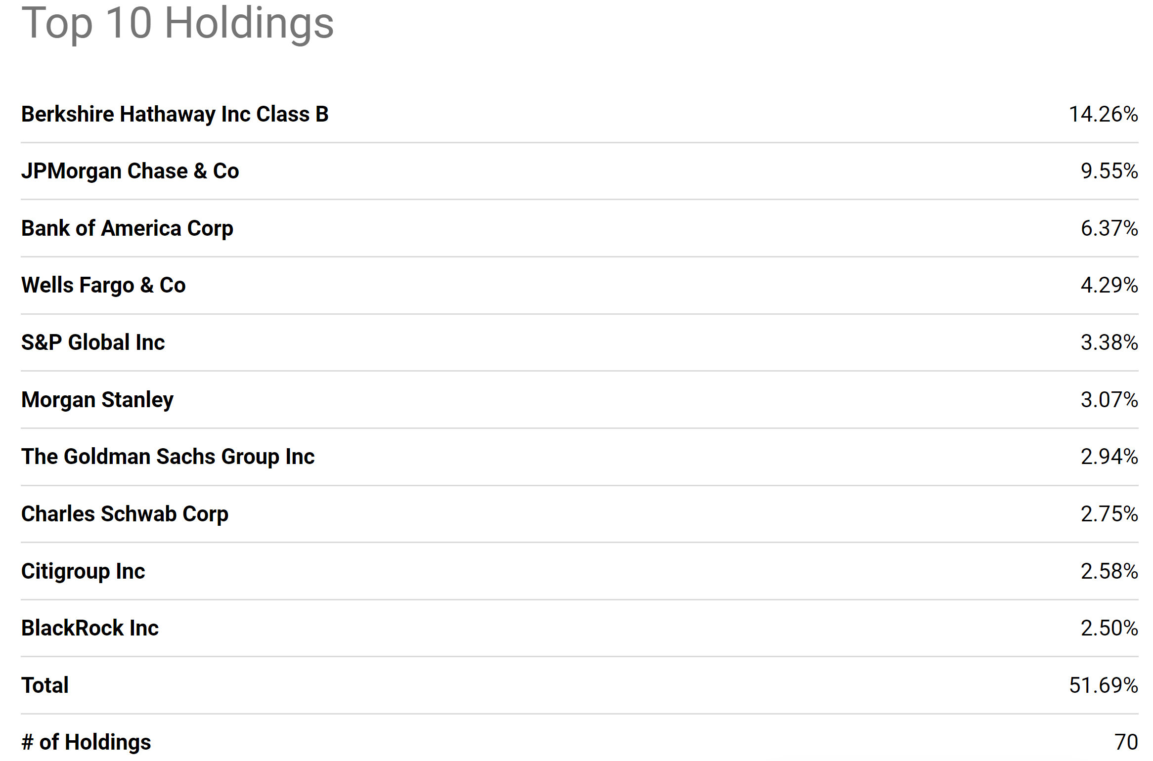
JPM’s superior profitability
The following chart shows JPM’s profitability in terms of ROE (return on equity). The ROE here is shown based on the annual financials provided by Seeking Alpha. As can be seen, the ROE of JPM is on average about 12.49%, very close to XLF’s ROE of 12.4%. However, note the improving trajectory of JPM’s ROE. It has been climbing from the ~10% level consistently over the years to the current level of 19.01%, which is not only substantially higher than its historical average but also higher than XLF by about 50%.
Seeking Alpha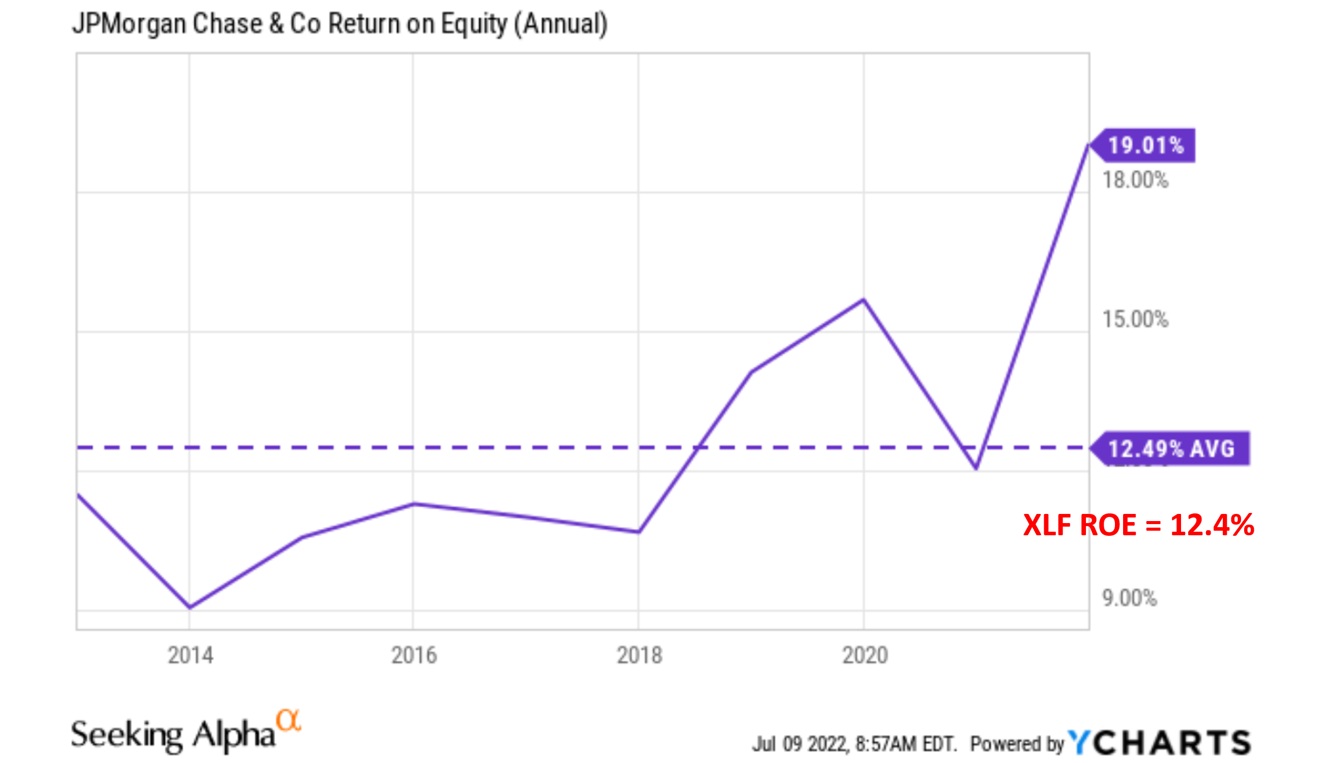
Looking forward, I am expecting JPM’s superiority over the sector to further expand for two considerations:
- Its leading scale and integrated business model. It is probably the most well-run integrated bank, with well-diversified revenue streams as you can see from the following chart. Its Consumer & Community Banking segment generates the most revenue, about 40% of the total revenue, followed by Corporate & Investment Bank (about 18% of total revenues), and then by Asset & Wealth Management (about 7.4% of total revenues). Deposits and investment assets have shown healthy growth, and the stabilization or the recovery of home lending, credit card, and automotive categories can create new growth.
- The bank enjoys a fortress balance sheet. It maintains fortress credit metrics. As a result, it is well positioned to expand operations, weather economics uncertainties ahead, and to enhance shareholder value through dividend raises and stock repurchases.
Admittedly, JPM is facing some volatile and challenging environments ahead (more on this in the risk section). But so is everyone in the financial sector. And my view is that JPM is in a better position than the average sector to weather the uncertainties forward with its leading scale and diversified income streams.
Merrill Edge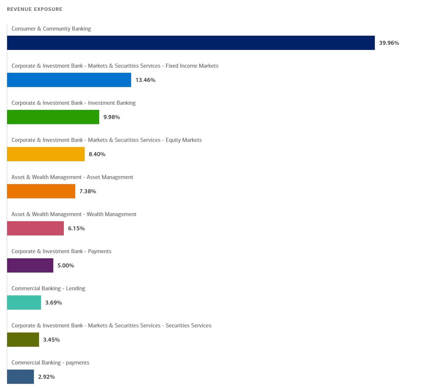
Dividends as a measure of owners’ earnings
Now on to valuation. As mentioned at the beginning, despite its superior profitability and scale, JPM is actually substantially undervalued relative to XLF. Its 10.11x PE is about 24% lower than XLF’s 13.2x PE.
Another effective way to evaluate their valuations is by their dividend yield because dividends provide a reliable measure of owners’ earnings as detailed in our earlier article. JPM is currently yielding 3.5% and XLF yielding 2.06%, thus JPM provides a 1.44% yield spread above XLF.
The following chart puts the 1.44% yield spread into a historical perspective by showing the yield spread between JPM and XLF over the past decade. As can be seen, the spread is positive most of the time because JPM has consistently paid a higher dividend yield than XLF in the past, on average by about 0.75%. Furthermore, you can see that the spread is bounded and tractable most of the time. The spread has been in the range between about 0.25% and 1.25% the majority of the time. Such a tractable YS suggests that when the spread is near or above 1.25%, JPM is significantly undervalued relative to XLF.
You can see the screaming buy signal for JPM during 2013 when the yield spread surged above the 1.25% level. And now we see a similar signal with the yield spread reaching 1.44%.
Author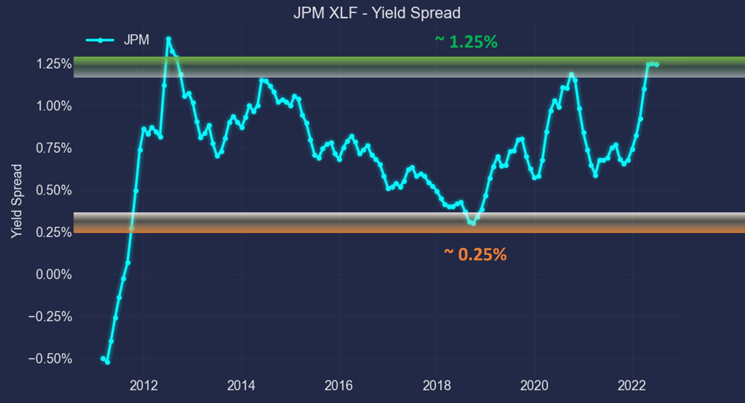
This next chart shows that their relative performance is positively correlated with their yield spread. It shows the 1-year total return (including price appreciation and the dividends – both regular and special dividends) from JPM minus that from XLF when the purchase was made under different yield spreads. You can see that there is a clear positive trend and the Pearson correlation coefficient is 0.37. Again, the current yield spread of 1.44% is close to the thickest level of the historical spectrum in a decade as shown.
Author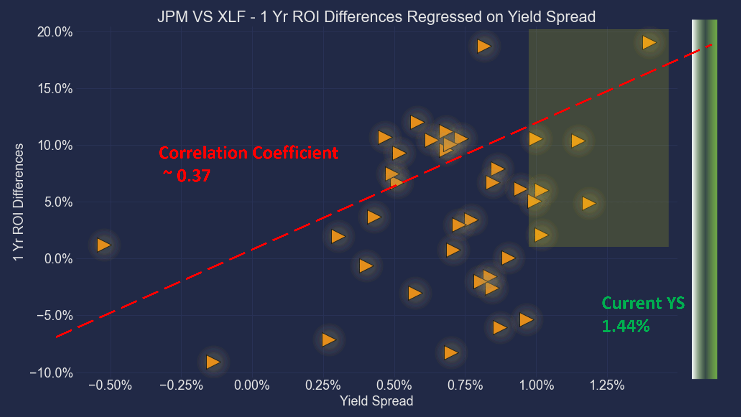
Summary and risks
We follow a top-down approach: we first get a grand picture and then examine the attractive sectors for specific investment ideas. Our sector dashboard shows the financial sector represented by XLF is now the 3rd most attractive sector. And its leading stock, JPM, is an even more attractive buy because of the superior profitability over the sector average and discounted valuation.
Finally, we want to point out the risks, both to our general approach and also specific to JPM. As detailed in our earlier article,
- Yield spread measures the RELATIVE risk premium and does not guarantee an ABSOLUTE positive return. It is a reliable method to accumulate more of the given securities in terms of SHARES, but not in dollar amounts. Absolute return is determined by both how many shares you hold (which the yield spread can help) and their prices (which the yield spread cannot predict).
- Lastly, dividend yields do not always reflect business fundamentals due to several factors such as tax law, political climate, the composition of the market index, et al. As a result, we do not directly use the yield spread in our investment or asset allocation decisions. In practice, we first adjust for the above corrections and then use the adjusted yield spread in our investment decision. But the data and approach illustrated here is the first place we check.
Specific to JPM, it is facing several macroeconomic uncertainties including the Russian/Ukraine situation and also the Fed hike expectations. The following Q&A during its April earnings report (abridged and emphases added by me) illustrate these uncertainties quite accurately:
Questions by John McDonald from Autonomous Research: I was wondering about the net interest income outlook… obviously, rate expectations have advanced since then. Could you give us a little bit of color on what kind of assumptions are underlying the net interest income ex Markets outlook?
Answers provided by Jeremy Barnum, JPM CFO: Good question. And yes, look, obviously, given what’s happened in terms of Fed hike expectations and what’s getting questioned into the front of the curve, we would actually expect the access part of in excess of $53 billion to be bigger than it was at Credit Suisse. So, to size that, probably a couple of million dollars.