Google gone mad! Scrapping iconic Pixel 6 design for basic Pixel 7 – a mistake Apple wouldn’t make
When it comes to the Pixel lineup, Google’s design choices throughout the years have been bizarre, to say the least…
To refresh your memory, we first witnessed the massive top and bottom bezels on the original Pixel and Pixel 2, while the Pixel 3 and Pixel 4 are to this day some of the strangest-looking Android flagships from a major brand that I can think of, thanks to the iconic Pixel 3XL bathtub notch and the Pixel 4’s massive forehead.Anyway, it might come as a shock to some, but the above-mentioned trials and errors aren’t even my biggest design gripes with Google’s recent flagships. In fact, I’m glad they’re gone. But I’m not so happy with all the design elements Google’s chosen to get rid of.
Most recently (prior to the launch of the Pixel 7), the biggest head-scratcher for me was why Google gave the Pixel 5 (arguably the best-looking Android phone of its time) symmetrical bezels and a small punch-hole selfie camera off to the side and then scratched this off when designing the game-changing Pixel 6 series, to give the 2021 Pixels uneven bezels. I’ll never get a satisfying answer to this question (although I it was most likely cost-related).
And now, Google did it again! They changed what made the iconic Pixel 6 and Pixel 6 Pro stand out without giving the public a chance to get used to one “Pixel look”. So, let’s talk about the controversial (in my opinion) Pixel 7 (re)design…
Another Google identity crisis after Pixel 5 – new Pixel 7 Pro camera design – an unnecessary cry for attention?

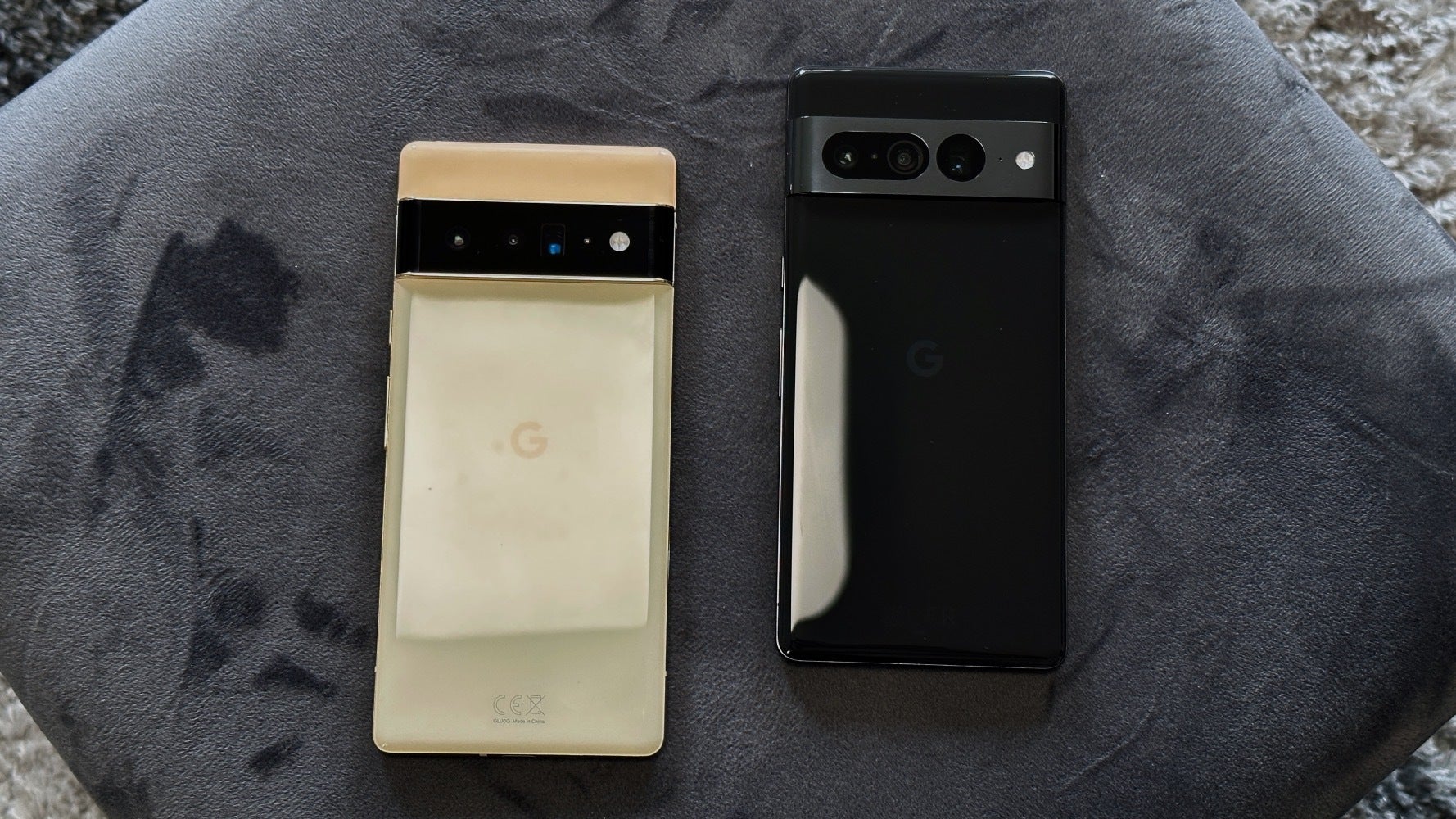
The Pixel 6 Pro in Sorta Sunny is the best-looking phone I’ve ever seen. The Pixel 7 Pro, on the other hand, wants to stand out with… camera holes.
Most people would agree that Google pretty much nailed the Pixel 6’s design – at least as far as the rear is concerned. I remember the genuine (nerdy) excitement floating around PhoneArena, Twitter, and YouTube before and after the launch of last year’s Google flagships -all thanks to how distinct and (for lack of a better word) badass the Pixel 6 and Pixel 6 Pro looked.
The Pixel 6 and Pixel 6 Pro’s black camera visor and dual-tone colorways:
- Made Google’s flagships immediately recognizable from a distance (up until then, this was something that could be said only about the iPhone)
- Made the Pixel 6 and Pixel 6 Pro stand out in the best way possible
- Flipped the script on “here’s our massive camera bump, and you should look at all the holes” (PG-13!)
The Sorta Sunny Pixel 6 Pro is my favorite phone design of all time. It’s the only phone (I’ve owned) that looks both sophisticated and badass at the same time. It belongs in a phone museum if this one exists.
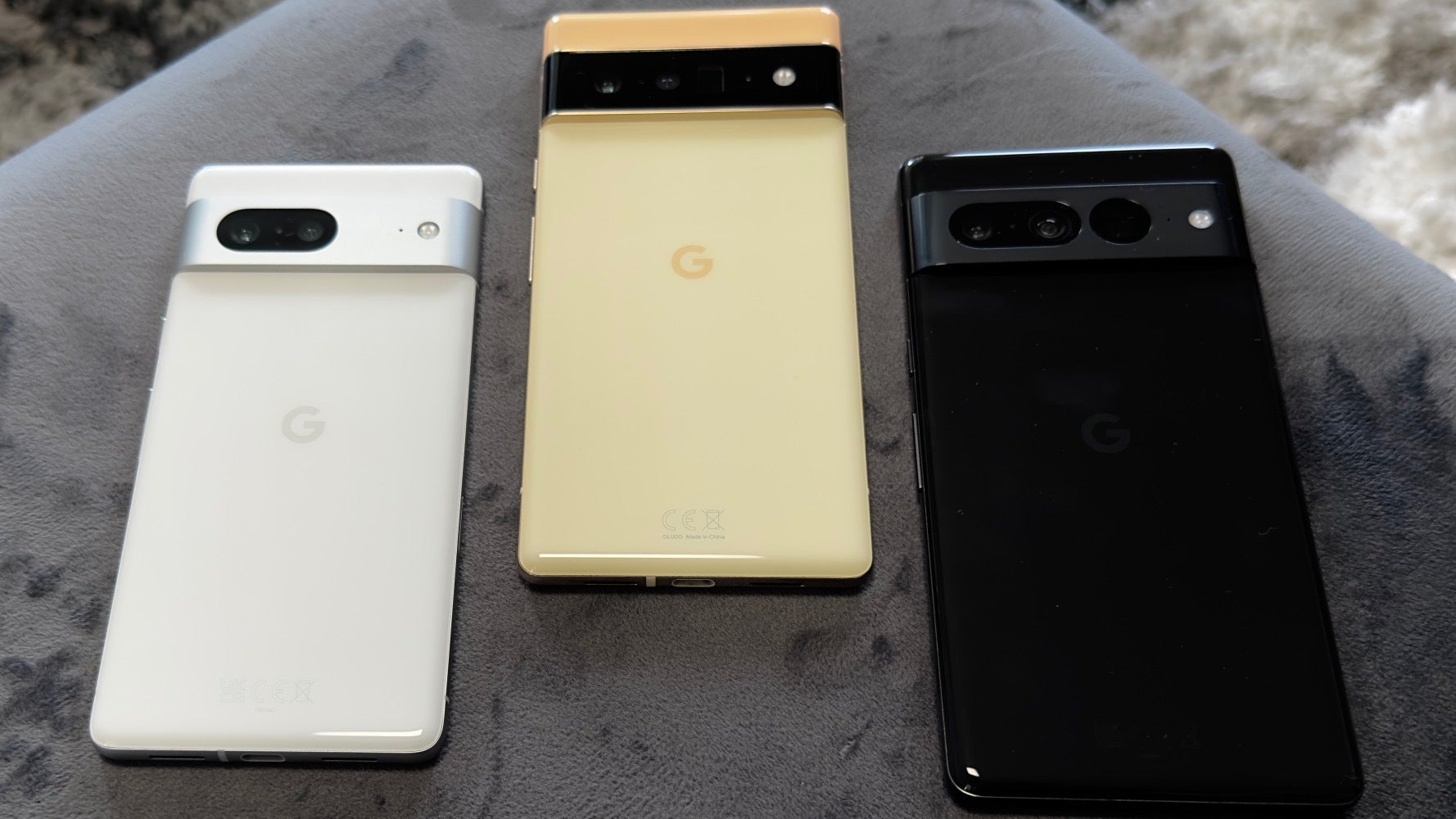
The new Pixel 7 and especially a Pixel 7 Pro look confused and confusing

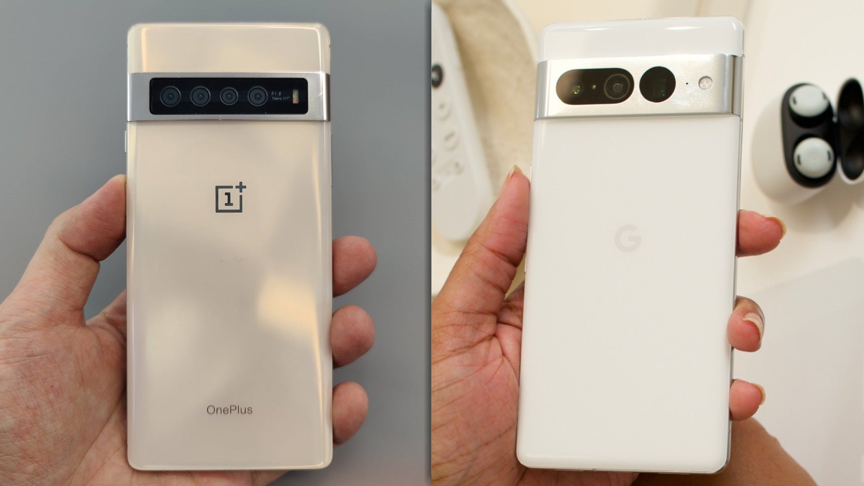
Just take a look at the Pixel 7 Pro next to the unreleased OnePlus 7 Pro prototype with a similar metal camera bar.
Now we get a Pixel 7 and especially a Pixel 7 Pro that look somewhat… confused about what they’re trying to be. Google’s keeping the camera bar that makes the Pixel stand out (great!), but the company is also turning the cameras/camera holes on the Pixel 7 into the center of attention by circling them around with metal grills in what looks to be a cry for attention.
When it comes to functionaldesign, The Pixel 7 Pro’scamera sensor arrangement still makes no sense (main camera – ultra-wide camera – zoom camera). Although early leaks led to believe Google was going to fix that, just like the Pixel 6 Pro, the Pixel 7 Pro has its ultra-wide-angle camera sitting right next to the periscope zoom lens, which makes lens switching more jarring than it needs to be. The order should (clearly) be – ultra-wide camera – main camera – zoom camera.
Pixel 7 fixes some Pixel 6 design quirks but is that enough to look past the controversial camera bar redesign?

This one’s for the OCD peeps.
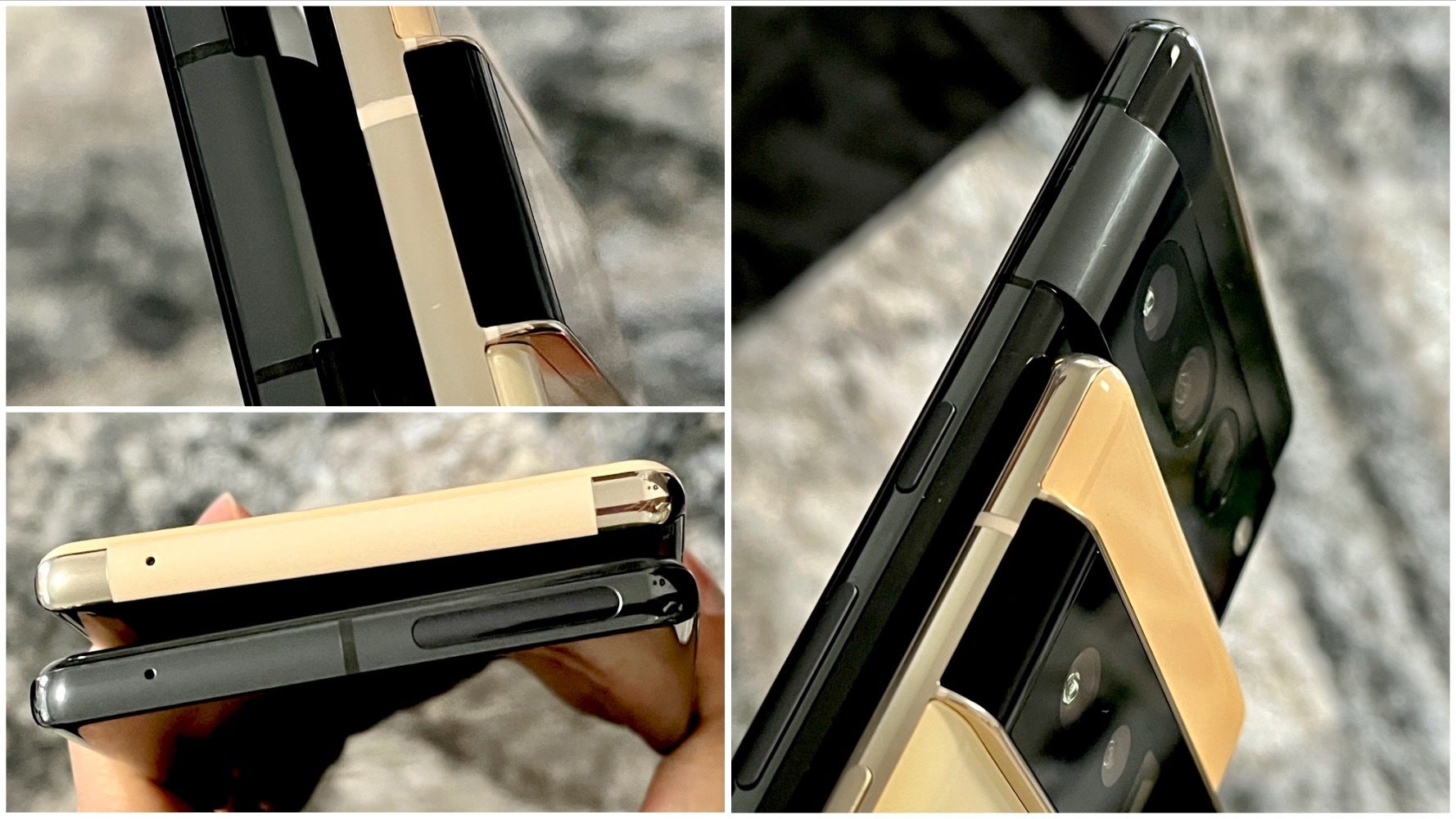
It’s not all bad, though! Google did get some things right with the Pixel 7 and Pixel 7 Pro design. In fact, the imperfections of the Pixel 6’s build are now ironed out on the Pixel 7s and this is admirable:
- The camera bar is now one with the frame of the phone, providing for a seamless look and, more importantly, feel when holding the phone
- The display on the Pixel 7 Pro is now noticeably less curvy, which is a very welcome change (at least for me)
- The top and side bezels on the Pixel 7 and Pixel 7 Pro now look evenly matched – unfortunately, the chin is still noticeably larger on both phones (I really miss the Pixel 5’s front design!)
- The patch-looking 5G receiver from the top of the Pixel 6 Pro is now gone, making way for a more subtle solution (although I thought the previous design gave the Pixel 6 more character, especially on my Sorta Sunny variant)
- The buttons on the right side of the Pixel 7 Pro now sit noticeably lower, which makes them a bit easier to interact with (Google is still reluctant to move the volume buttons to the left though)
- Even the regular antenna lines (not 5G) are now aligned much better according to the camera bar – not to trigger any users with OCD
Now, would that be enough to make up for the lost identity of the Pixel 6 series is up to you to decide…
Pixel 8 will be Google’s chance to take a firm Apple-like stance on design because Pixel 7 failed to do that

Copy this Apple thing, Google!
Finally, I want to make sure a few things are clear:
- Of course, design preferences are something subjective by nature – so there really isn’t “wrong or right” there
- Design isn’t just about looks – functional design is as or arguably more important
With that in mind, the question that remains standing is whether Google is ready to commit to one design and stick to it? Or will Sundar Pichai & Co keep pimping it up for freshness? You know – every year. Because why not.
For example, Apple’s iPhone has looked identical (at least from the rear) for ages now. Sure, the triangular camera bump design is starting to look rather tired now (especially next to a Pixel), but Cupertino managed to turn the iPhone’s rear into a self-marketing tool and get in your head, right? That matters!
The Pixel 6 was the perfect opportunity for Google to establish a Pixel look and keep working on perfecting the same design over the course of 3–4 years. It was written in the stars – Pixel 6 brought the first Google-made Tensor chip, the first camera upgrade on Pixel in ages, and a brand new design (which no one expected) – why get rid of this already bold and massive upgrade?! Instead, we have the Pixel 7, which although similar to the Pixel 6, appears different enough to lose the signature look that Google could’ve pursued.
Anyway, so what about the Pixel 8? Ideally, Google would bring back the blacked-out camera visor, but I think it’s very safe to assume that’s not going to happen because Sundar Pichai & Co want to make an impression and switch things up, which is good.
I’m just not sure changing what seemed like a perfect and perfectly recognizable design was the right way to go about it…


